Robin Whittle's Show-and-Tell - Valentines Day Cards
Back to the Show and Tell page for various items of
eclectic
interest such as corsetry advertisements, a 1913 colour photograph of a
demure young woman, old photos, colour slides from a ca. 1950 Sun
Beachgirl
Quest, photos of eucalypt and temperate rainforest in the
Strzelecki
Ranges, South Gippsland, Victoria, Australia.
Back to the First
Principles page for many other items of potential
interest,
such as my 71 foot long Sliiiiiiiiiiinky, paintings by an
artist
friend of mine when she was four and five years old and photos from a Green
Ant trance techno dance party.
In February 2001, some of these images were featured in the International
Artists Images of Eyes Gallery http://www.imagesofeyes.com
.
Robin Whittle 28 January 2000 rw@firstpr.com.au
Yesterday a friend in Pennsylvania sent me five Valentines Day
cards.
A big kiss to you my special friend!! The two with post dates are
from 1911 and 1914, and another is copyright 1910.
Beside each low resolution image are links to large images including
one of the back of the card. There are also some detail images of
the card and the stamp and postmark. Some of the images are very
large in terms of pixels and file-size. These can be viewed on
your
browser, but you will need to scroll around. The idea is you can
download them, edit them and make your own cards with an ink jet
printer.
The file names contain the image size in horizontal and vertical
pixels.
Instructions for downloading files: For Netscape
Communicator,
to download, hold Shift and click the link. To save an
image
(again with Netscape) click the right button on your pointer device
(trackball,
mouse . . .) on the image, and you will have the option to save it
wherever
you like on your hard disk. These don't work with MS Internet
Explorer
5, but if you shift click on a link, you get the image in a separate
browser
window, and you can File: Save it from there. So how do you save
an image you see in a web page with MSIE? Run Netscape!
I have always had a fetish for printing. I especially like
objects – human-made and otherwise – which reveal more detail the
closer
you look at them. I will enjoy looking at these with my stereo
zoom
microscope! If you don't mind downloading large files, you can
have
a microscope-like view on your screen.
I have determined that most video monitors typically have an
exponential
brightness curve, so 50% grey in an image file produces (for instance)
only 22% of the light of 100% white. Scanners and the voltage
output
of VGA cards is perfectly linear (unless you have gamma correction on
your
PC or when scanning) and so the mid-tones of images appear darker on
screen
than they should. Consequently, on your screen, these images
probably
look a bit richer and have more contrast than they do in real
life.
For instance, on the last card, in real life the card's outside "white"
area is dimmer than I see it on my screen, and the darkest brown in the
hat is lighter than on screen. (I scanned these with a 600DPI
Umax
Astra 1200S scanner. I modified it with reflectors to illuminate
the artwork from the opposite angle to the light as well, to reduce
shadowing
with non-flat items.)
 |
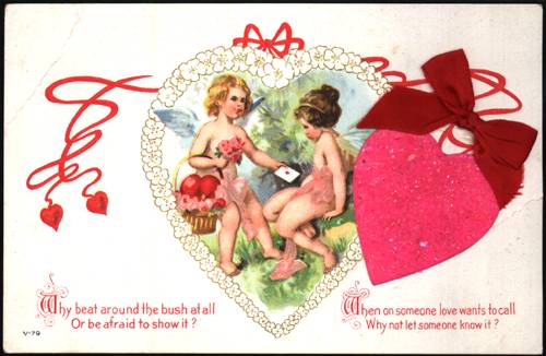
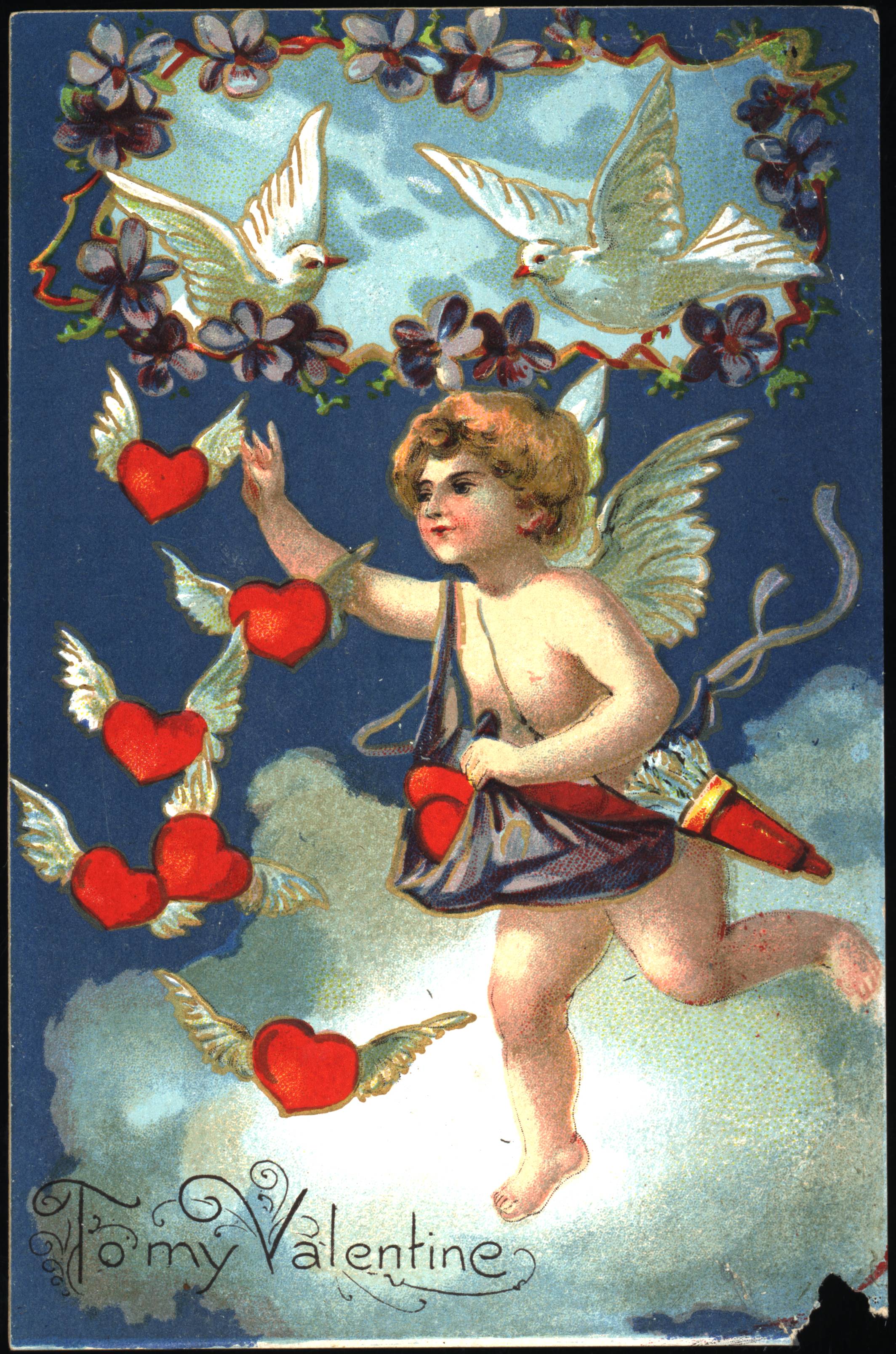
Fixing a broken heart indeed! An extraordinary
image. This
and the one below are printed in Saxony – which as best I can tell is
central
and north-central Germany. Lower Saxony seems to be in the north,
so Saxony might be just north-east of Frankfurt, which I understand has
long been a centre of printing and other technologies.
I haven't counted carefully, but I estimate there are about 12
colours
of ink used in this card. I imagine it is lithography, because I
see no evidence of any impression which would probably have been made
by
letterpress. Perhaps this and the other cards are
"chromolithographs".
Some of the colours are only in a few places, making letterpress
especially
prone to leaving an impression. I don't think it is gravure,
since
there is no continuous tone of ink, and the ink is plastered on quite
thickly.
This was almost before photographic separation of colour
photographs
or illustrations. (See another section of this Show and Tell
department
for a 1913 example and a link to an online book and museum of printing
and photographic techniques). The artwork was evidently 12 or so
separate images, each manually created. The registration is
good.
There must have been a great deal of trial and error with the artwork
and
ink colours – and some interesting decisions on what order to print the
colours.
All these cards apart from the second last have been embossed
after
printing.
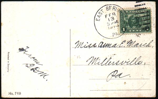
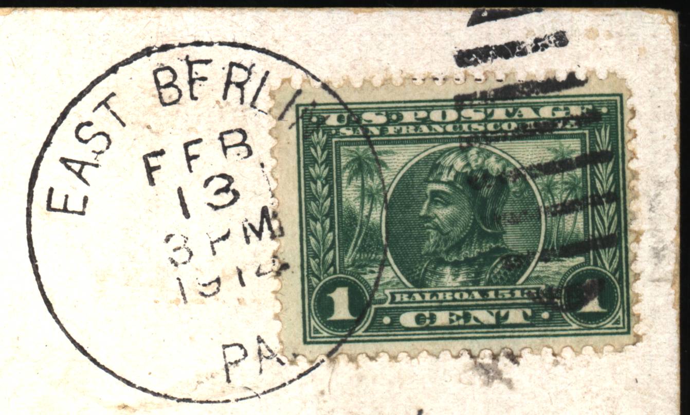
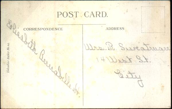
This was sent to Miss Anna E. March of Millersville,
Pennsylvania on
13 February 1914.
|
 |
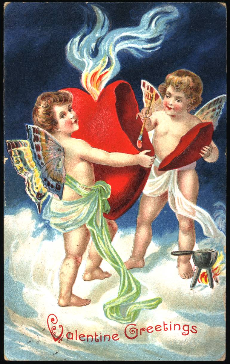
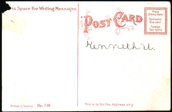
Evidently from the same manufacturer in Saxony, this card
mentioned
specific postal rates: "Domestic One Cent, Foreign Two Cents". I
think this indicates it was printed for the US market. By
changing
a single image for one colour of ink, the front of the card could be
made
for any language.
This card has an earlier catalogue number than the
first. One
ink colour is gold.
|
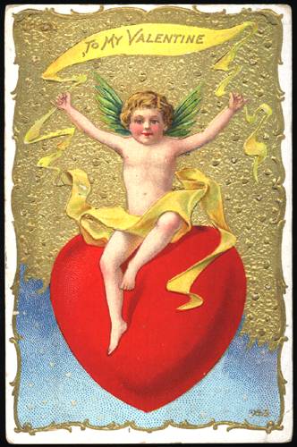 |
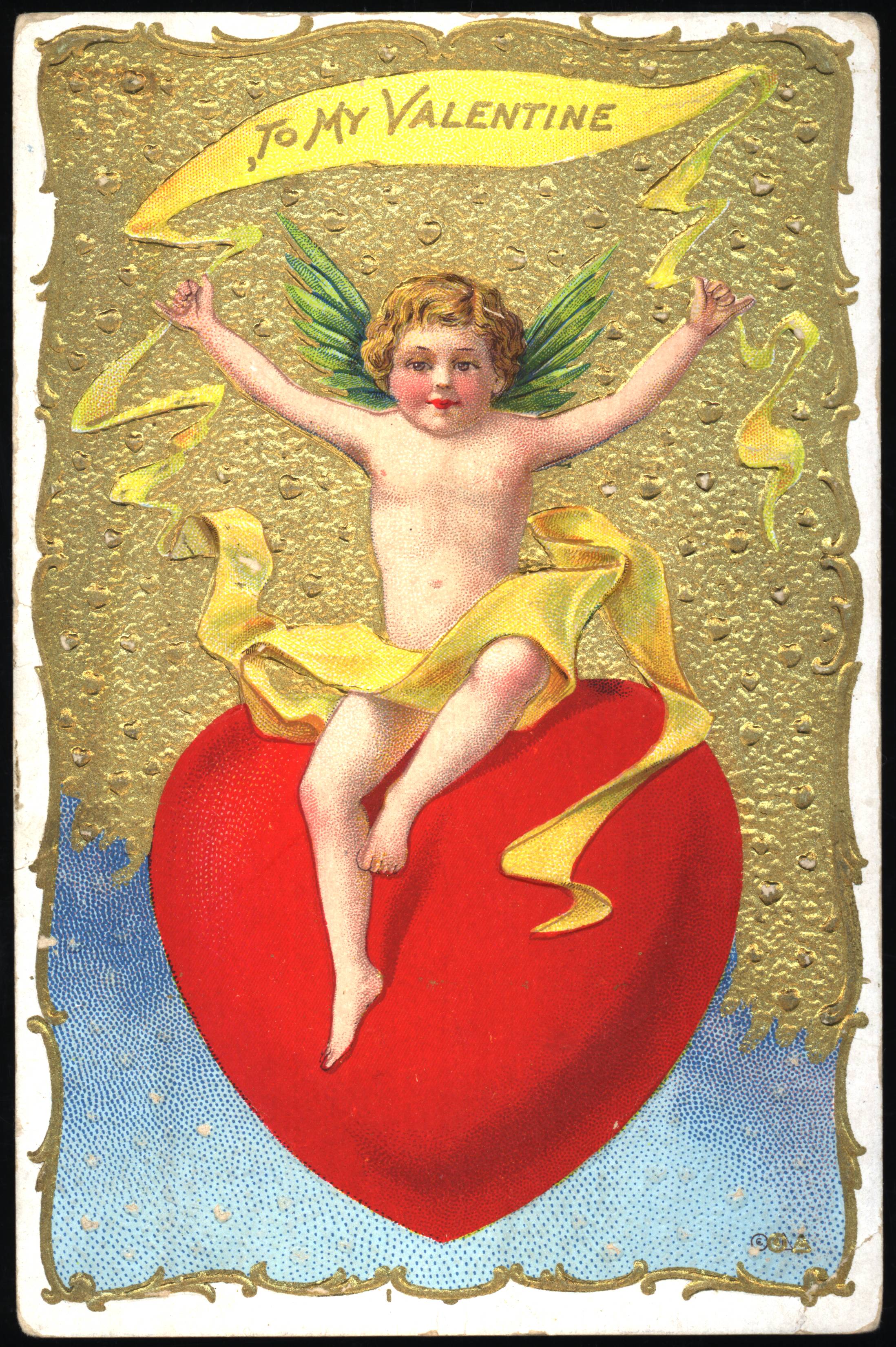
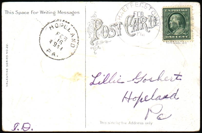
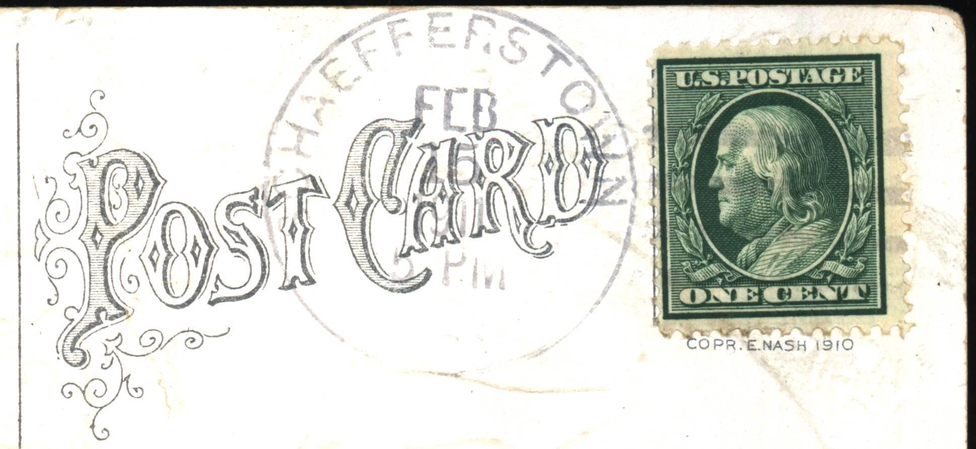
This one has a simple, welcoming design with lots of
gold. This
was sent to Lillie Goshert of Hopeland Pennsylvania, from Haefferstown,
on 15 February 1911.
A copyright notice below the stamp reads: "COPR. E. NASH
1910".
|
 |
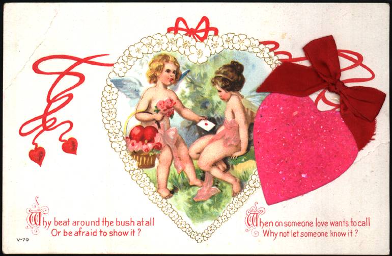
This card has a stuck-on hot-pink heart with little shards of
very
fine broken glass for glitter, and a neat red satin ribbon.
|
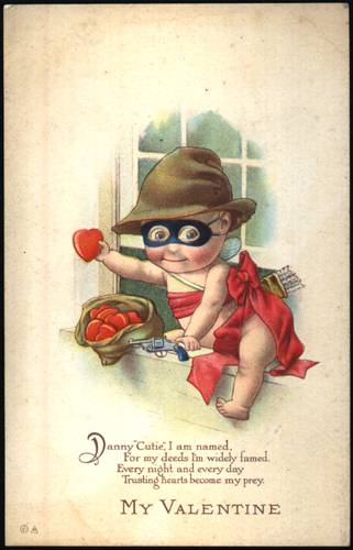 |
Your analysis, Dr Spock??
|