Updated 12 October 1999
Back to the pink noise page.
As discussed earlier, the Voss-McCartney
Pink Noise generator sums a number of "rows" of independent white noise
sources. Each row is updated at half the rate of the row above. The top
row is updated every sample.
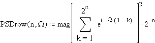
The PSD of Each Row
By modelling each row as a sample and hold (or zero order hold (ZOH)) applied to a white noise source, it is possible to work out each rows contribution to the overall spectrum.
If n is the number of the row, starting at 0 for the top row, then we get the following PSD for that row:
Here W is a normalised frequency variable. W varies from 0 to 2p as the frequency varies from 0 to the sampling frequency.
The PSD is worked out by simply taking the Z transform of a ZOH which holds for 2^n samples, and substituting exp(i W ) for Z (which evaluates the Z transform on the unit circle), then squaring the magnitude (actually done by multiplying by its conjugate).
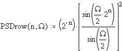
The above PSD for each row simplifies to...
Now let's see some graphs of the PSD of each row (shown on both linear and log scales):
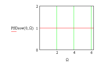
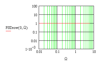
Row 0
The noise is updated every sample. This is flat (as white noise should be).
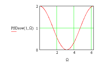
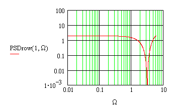
Row 1
The noise is updated every second sample. The total power is the same as for row 0, but some of the power has been pushed towards 0Hz.
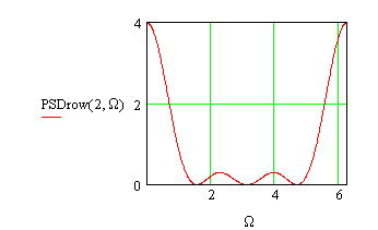
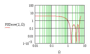
Row 2
The noise is updated every fourth sample.
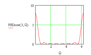
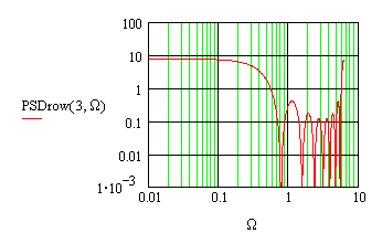
Row 3
The noise is updated every eighth sample.
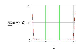
Row 4
The noise is updated every sixteenth sample.

The PSD of Multiple Rows Added Together
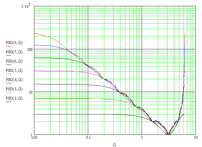
The output of the pink noise generator is the sum of N rows, numbering 0 to N-1.
The PSD at the output is just the sum of the PSDs of the rows, as the sources are independent.
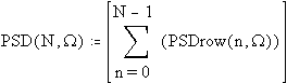
I do not have a closed form expression for this PSD.
It is easy to evaluate numerically,
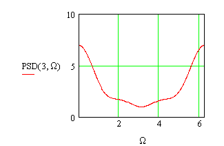
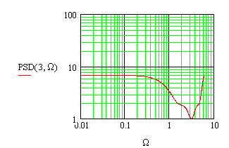
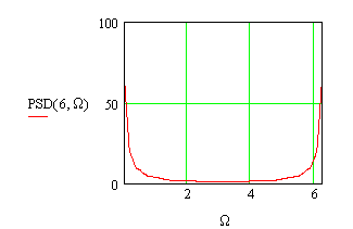
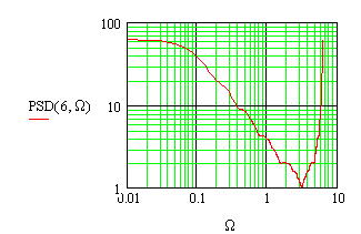
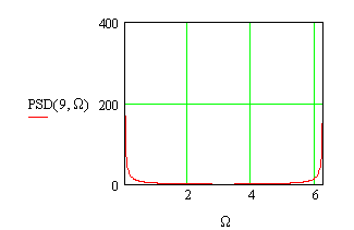
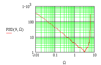
and the results for N = 3, 6 and 9 have been plotted below. Note that there
is a small amount of ripple (about 1dB) which does not go away regardless
of the number of rows added.
Three Rows Added
Six Rows Added
Nine Rows Added
Comparison Between Different Numbers of Rows
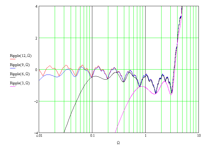
The deviation from the ideal 10dB/decade curve (ripple)
A flat line should result if the PSD is multiplied by W . This enables us to see how well the Voss-McCartney generator approximates pink noise.
The following graph shows the deviation (or "ripple") for values of N (the number of rows added) of 3, 6, 9 and 12.
The vertical scale is 2dB/division.
(We use 10log() to convert the PSD to dB, as the PSD is a power measure.)
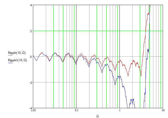
The effect of not including row 0
The original algorithm didnt include "row 0" the white noise source added every sample.
The following graph shows the improvement in accuracy obtained by adding this extra source. It seems to do a good job of filling in the deeper nulls, as James McCartney suggested. There is no improvement at low frequencies, however.
The vertical scale is 2dB/division.
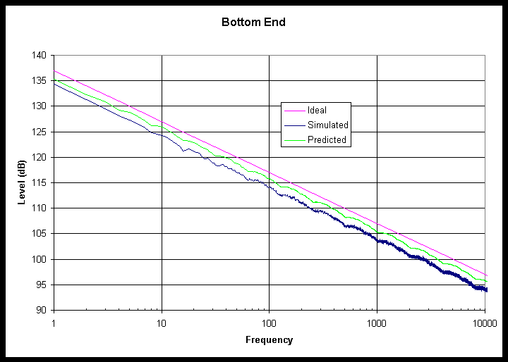
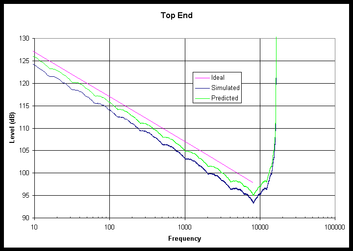
Simulation results
It is possible to experimentally determine the PSD by taking the DFT of a number of samples of the pink noise generator. Ideally, the results should look similar to the above graphs. However, the experimental graphs look "noisy" or fuzzy.
The fuzz was reduced by "ensemble" averaging. This involves performing multiple runs (with different random number seeds of course) and averaging the results. This sort of averaging reduces the noise in the graphs without changing the shape of the spectrum, but it only produces valid results if the underlying process is stationary, so it cant be used for true pink noise but it is ok here.
The random number generator tested had 19 rows (N = 19). So that all 19 rows were actually used, 2^19 (524288) points had to be generated per test. A 524288 point FFT was used to convert to the frequency domain, and the output was converted to power.
This test was run 1024 times, and the powers for each test were added, and the result was converted to dB.
Excel was used to graph the result. Unfortunately, Excel can only handle 32000 points per plot, so separate graphs were done for the bottom end (the first 10000 points (not including the DC bin)) and the top end. The top end plot was reduced down to 16384 points by summing the power of groups of 32 bins. This makes it look like the sample rate is 16384, and the level starts to rise above the Nyquist frequency at 8192.
The final result looks similar to the theoretical curve for a 19 row generator, which is also shown on the plots. The curves have been vertically offset slightly for clarity.
Back to the pink noise page.
--
Allan Herriman
Originally 14 September 1999, updated 5 October and 12 October 1999.)
This work has been placed in the public domain.